LouisaFoods
With TURN Agency
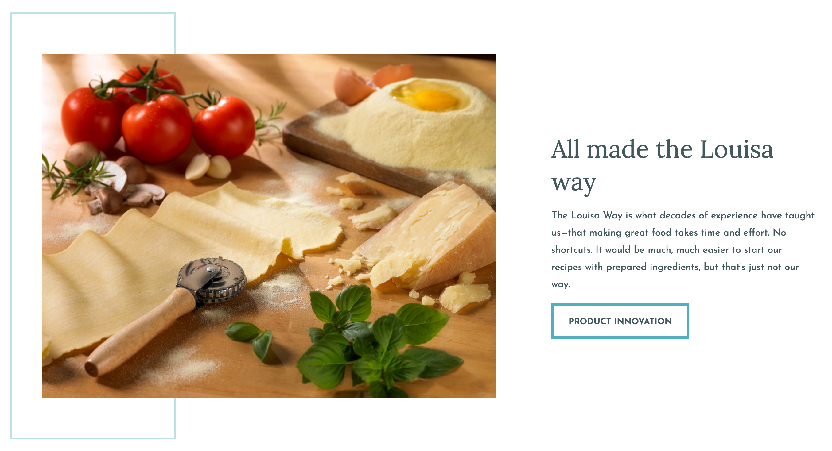
Louisa Foods
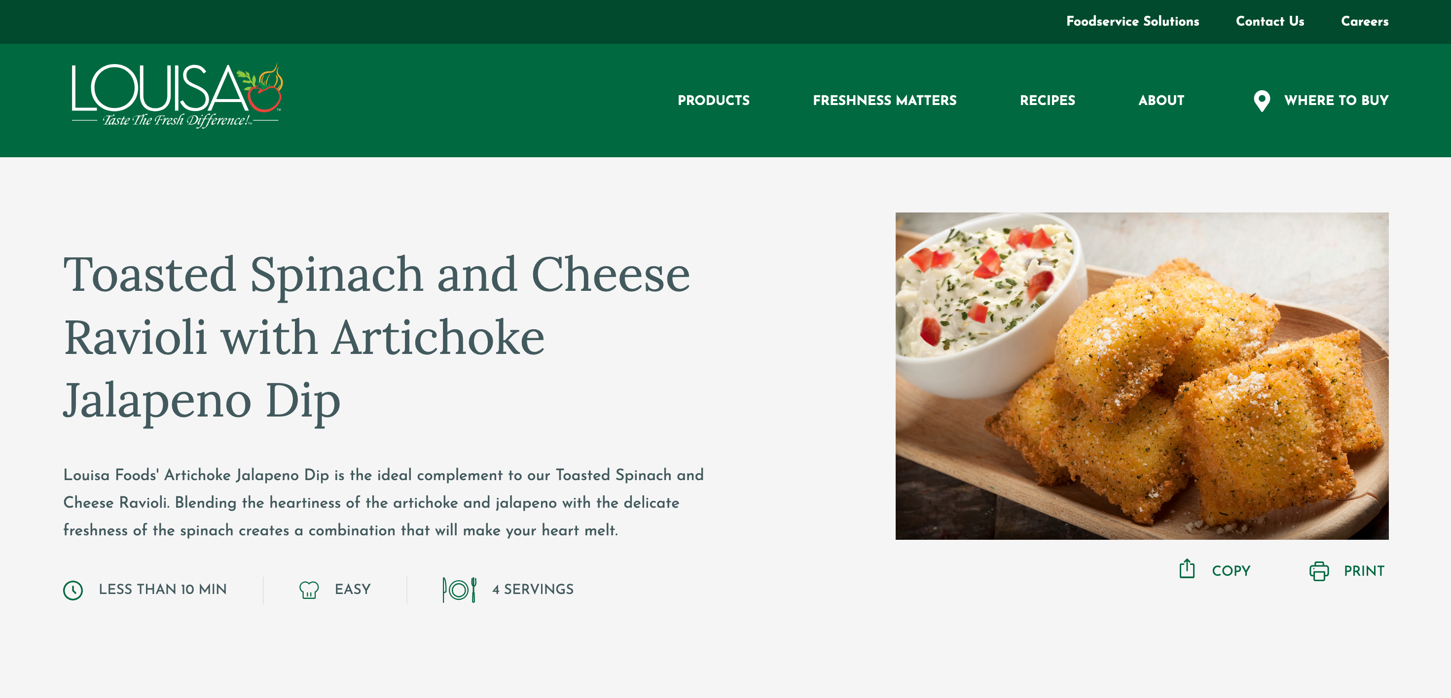
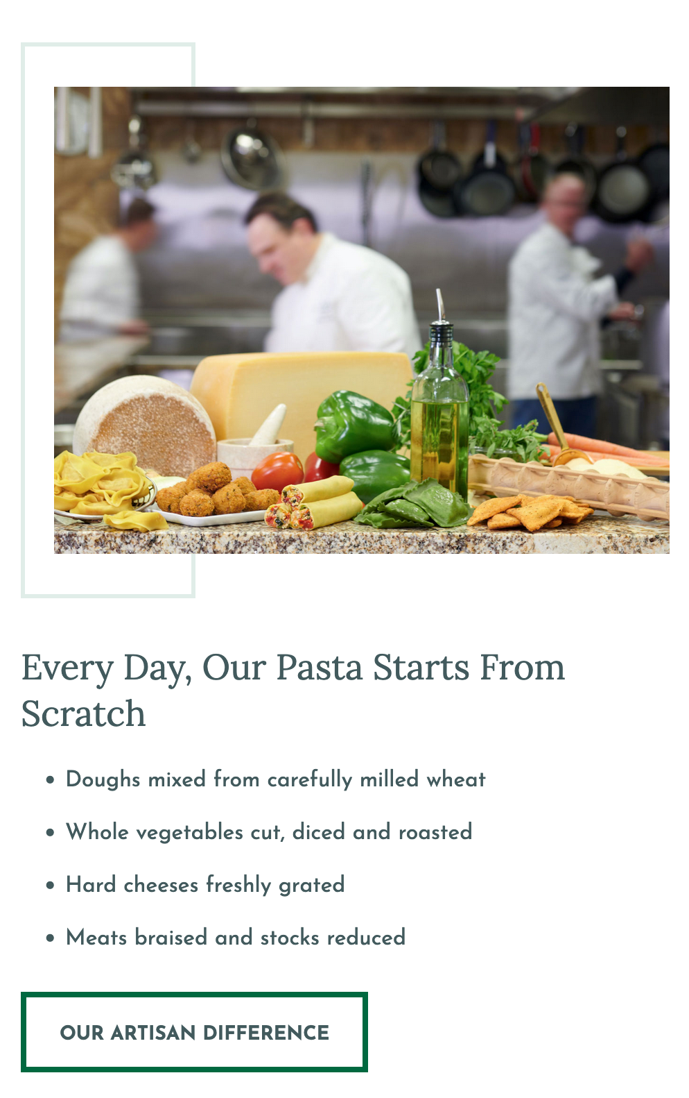
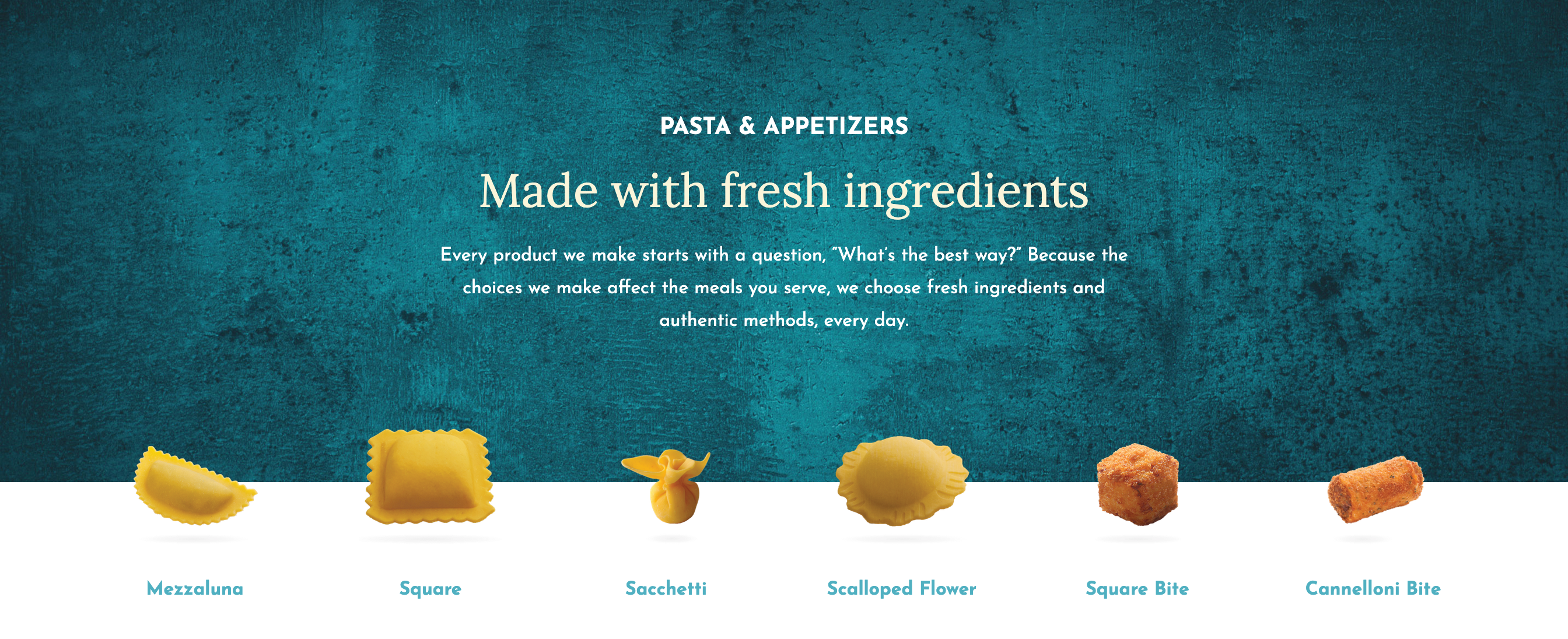
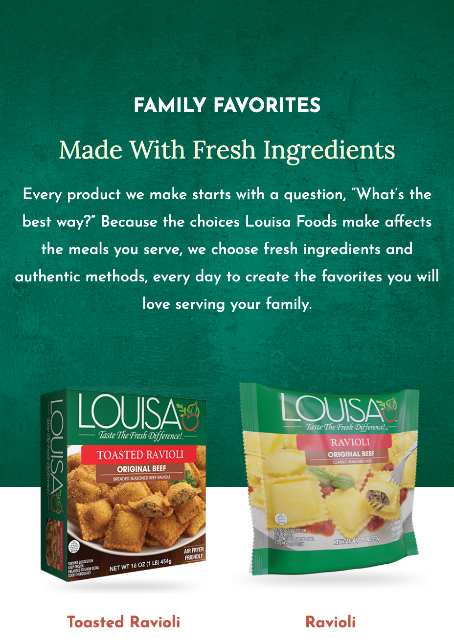
Much to my (and my wife’s) delight, my workstation was flooded with images of delicious food and pasta for the duration of the Louisa Foods build. The fun palette of images, content, and colors makes for an eye-catching and mouth-watering catalog.
This project with TURN Agency provided the client with two different color treatments for the same component library; one each for their consumer and foodservice landings. This allowed the frontend team to structure the stylesheets and projects with this in mind. We set up the two “themes” from the beginning inside the project and used Storybook JS stories to swap between the two to help visually QA the deliverables.